> ## Documentation Index
> Fetch the complete documentation index at: https://docs.osvi.ai/llms.txt
> Use this file to discover all available pages before exploring further.
# Customise the widget
> Change the launcher, colours, header and how interactive tools look
You customise the widget in your page, not in the dashboard. Add `data-*` attributes to the script tag, or set `window.OsviChatConfig` before the script loads. Attributes win over the config object. Every option is listed in the [Configuration reference](/website-chat/configuration).
```html theme={null}
```
The widget mounts as soon as its script loads. To change the configuration afterwards, call `OsviChat.destroy()` and then `OsviChat.init(config)`. The pre-load stub queues `open()`, `close()` and `toggle()` calls made before the script loads.
## Launcher
* `position`: `right` (default) or `left`.
* `launcher: "none"` hides the bubble so you can open the chat from your own button with `OsviChat.open()`.
* `greeting`: a short dismissible bubble beside the closed launcher, such as "Questions? Ask us". Once dismissed, it stays hidden for that visitor.
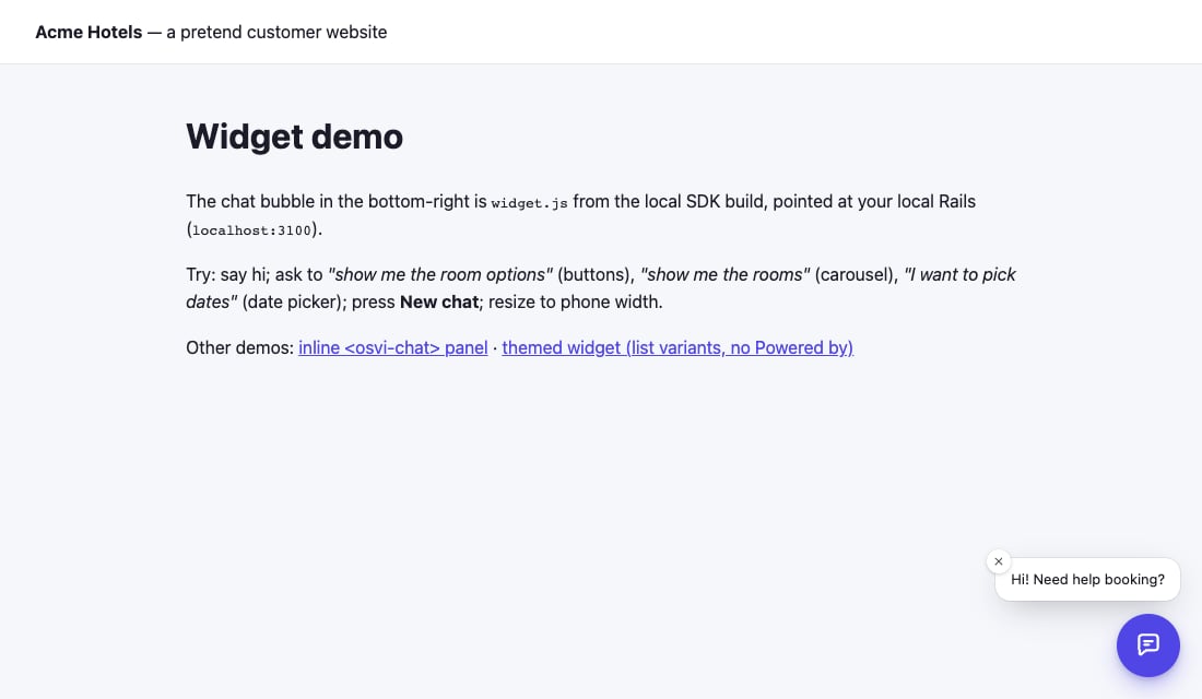 Floating launcher before the chat panel is opened.
## Colours and shape
Set `theme.mode` to `light` or `dark`, `theme.colors.primary` for your brand colour and `theme.radius` for corner rounding. All six colours are in [Theme](/website-chat/configuration#theme). Styles live in the widget's Shadow DOM, so your site's CSS does not leak in and you need no extra `style-src`.
Floating launcher before the chat panel is opened.
## Colours and shape
Set `theme.mode` to `light` or `dark`, `theme.colors.primary` for your brand colour and `theme.radius` for corner rounding. All six colours are in [Theme](/website-chat/configuration#theme). Styles live in the widget's Shadow DOM, so your site's CSS does not leak in and you need no extra `style-src`.
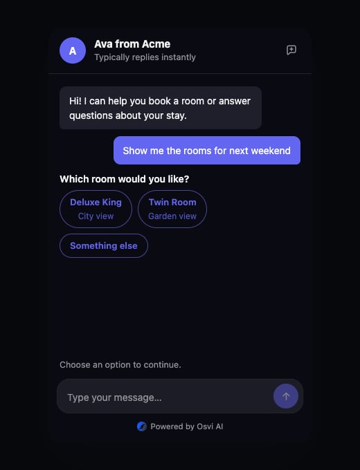 Dark theme applied to the widget.
## Header
The header shows the agent's name by default. Set `header.title`, `header.subtitle` and `header.avatarUrl` (or `data-title`, `data-subtitle`, `data-avatar`) to change it. `newChat` and `newChatHistory` control the New chat button.
## Interactive tools
The agent can show buttons, cards and date pickers. Choose `chips` or `list` for buttons and `slider` or `list` for carousels. The date picker has one look and supports a single date or a range, as the agent asks.
The examples below use an SDK test agent; the content depends on your agent.
Dark theme applied to the widget.
## Header
The header shows the agent's name by default. Set `header.title`, `header.subtitle` and `header.avatarUrl` (or `data-title`, `data-subtitle`, `data-avatar`) to change it. `newChat` and `newChatHistory` control the New chat button.
## Interactive tools
The agent can show buttons, cards and date pickers. Choose `chips` or `list` for buttons and `slider` or `list` for carousels. The date picker has one look and supports a single date or a range, as the agent asks.
The examples below use an SDK test agent; the content depends on your agent.
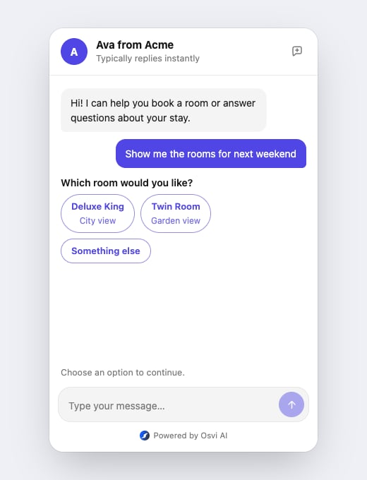 Button actions displayed as chips.
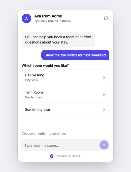 The same button actions displayed as a list.
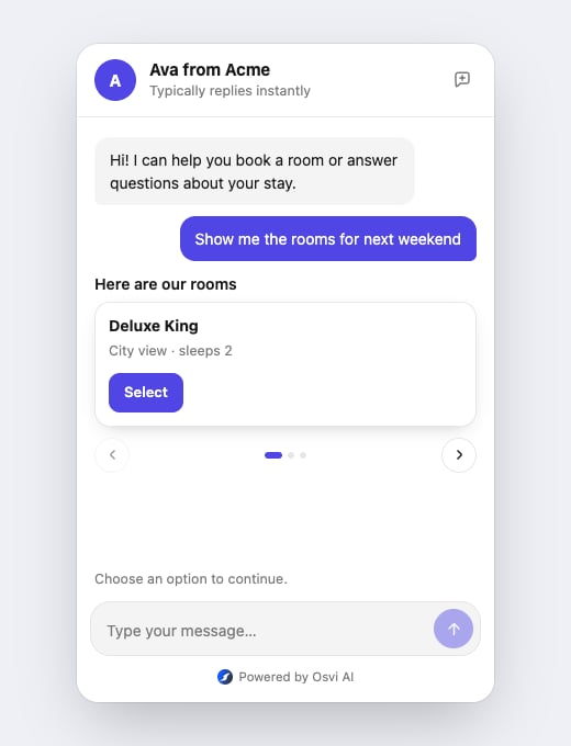 Carousel cards displayed in a slider.
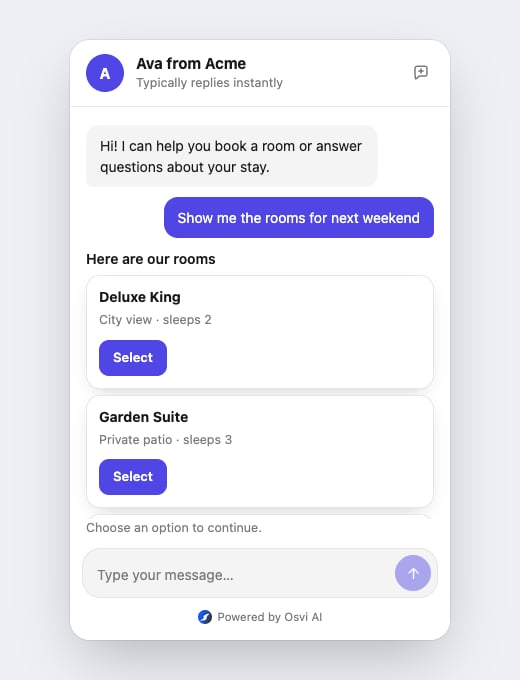 Carousel cards displayed as a list.
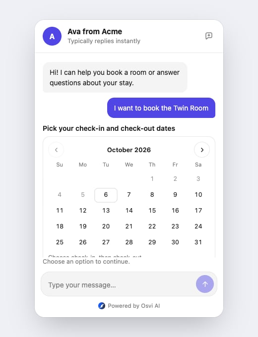 Date picker interaction supplied by the agent.
## Text and language
Every visible label can be replaced through `strings`, for example to translate the widget. The keys and defaults are in [Interface strings](/website-chat/configuration#interface-strings).
## Welcome message
The first message the chat shows is set in the dashboard, not in the widget. See [Welcome message](/website-chat/dashboard-settings#welcome-message).
This documentation is built and hosted on [Mintlify](https://mintlify.com), a developer documentation platform.
Date picker interaction supplied by the agent.
## Text and language
Every visible label can be replaced through `strings`, for example to translate the widget. The keys and defaults are in [Interface strings](/website-chat/configuration#interface-strings).
## Welcome message
The first message the chat shows is set in the dashboard, not in the widget. See [Welcome message](/website-chat/dashboard-settings#welcome-message).
This documentation is built and hosted on [Mintlify](https://mintlify.com), a developer documentation platform.