
data-* attributes to the script tag, or set window.OsviChatConfig before the script loads. Attributes win over the config object. Every option is listed in the Configuration reference.
OsviChat.destroy() and then OsviChat.init(config). The pre-load stub queues open(), close() and toggle() calls made before the script loads.
Launcher
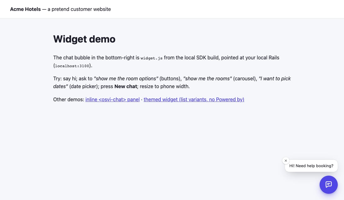
position:right(default) orleft.launcher: "none"hides the bubble so you can open the chat from your own button withOsviChat.open().greeting: a short dismissible bubble beside the closed launcher, such as “Questions? Ask us”. Once dismissed, it stays hidden for that visitor.
Colours and shape
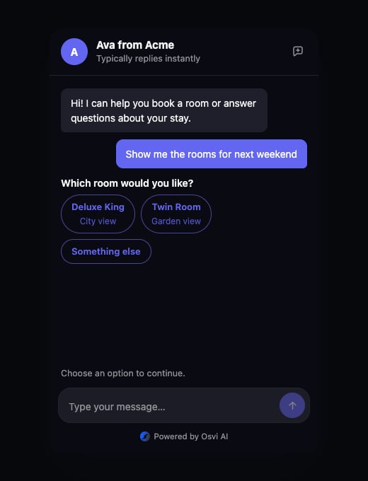
Settheme.mode to light or dark, theme.colors.primary for your brand colour and theme.radius for corner rounding. All six colours are in Theme. Styles live in the widget’s Shadow DOM, so your site’s CSS does not leak in and you need no extra style-src.
Header
The header shows the agent’s name by default. Setheader.title, header.subtitle and header.avatarUrl (or data-title, data-subtitle, data-avatar) to change it. newChat and newChatHistory control the New chat button.
Interactive tools
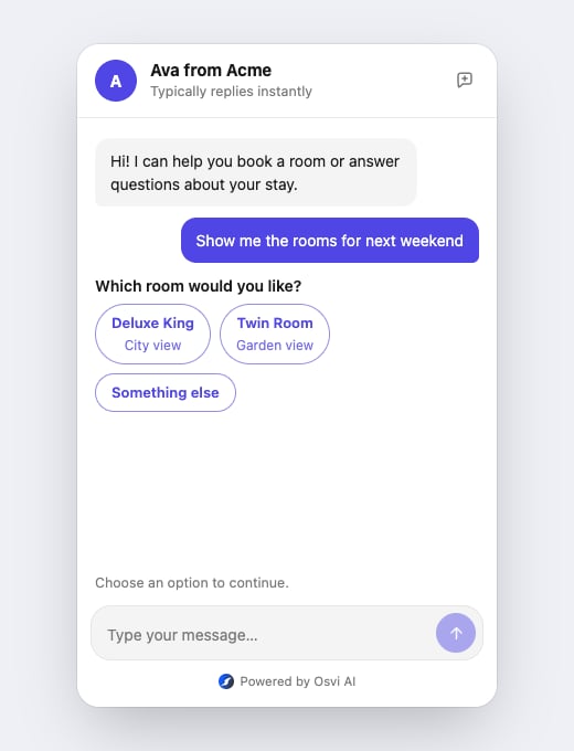
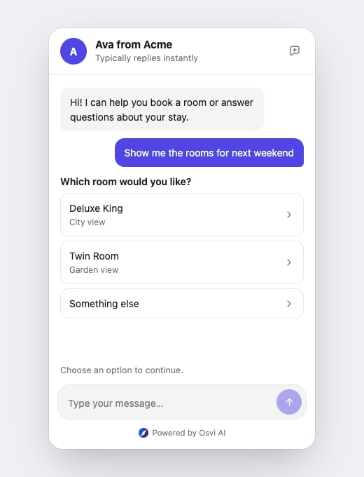
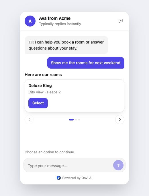
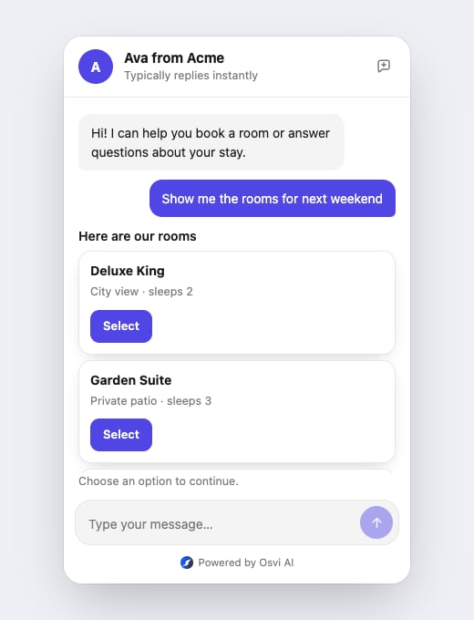
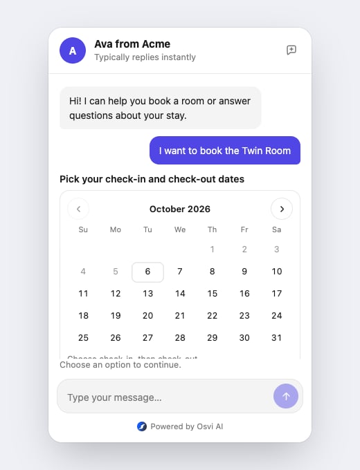
The agent can show buttons, cards and date pickers. Choosechips or list for buttons and slider or list for carousels. The date picker has one look and supports a single date or a range, as the agent asks.
The examples below use an SDK test agent; the content depends on your agent.
Text and language
Every visible label can be replaced throughstrings, for example to translate the widget. The keys and defaults are in Interface strings.